Leading UX Design for a Sign Language Video Dictionary
DESIGN FOR ACCESSIBILITY

Tl;dr
I was the lead UX/UI designer for the Filipino Sign Language (FSL) Dictionary, the first open-access sign language video dictionary in the Philippines. The platform was created to make communication and learning accessible for Deaf and Hard-of-Hearing communities by addressing the lack of accurate, standardized resources. I joined the project in the early conceptual stage, where I defined the information architecture, designed user flows, established the visual system, and created wireframes and mockups to guide the team toward an MVP.
Affiliation
Accessifiers
skills
Information Architecture, Wireframing, User Flows, High-Fidelity Mockups, Style Guide Creation, Accessibility (WCAG)
team
4 UX designers, 1 UX Researcher, 3 Developers, Project Manager, Product Owner
tools
Figma, Miro, Lovable, V0, Slack
design challenge
Deaf and Hard-of-Hearing communities in the Philippines lack accessible, standardized sign language resources that reflect regional variations and academic terminology. The team needed to design a platform that supports both interpreters and learners.
Solution
We designed a mobile-first MVP with core features like searchable signs, community voting to ensure accuracy, and streamlined video uploads for interpreters. Accessibility was prioritized through WCAG AA compliance, low-bandwidth optimization, and support for older devices. The product mockups secured buy-in from Deaf organizations and positioned the platform as the first open-access Filipino Sign Language dictionary, projected to serve over 1.7 million users.

category text
Heading Text
Add paragraph text. Click “Edit Text” to update the font, size and more. To change and reuse text themes, go to Site Styles.


user groups
Understanding the Users
Based on research and community insights gathered by Accessifiers in the Philippines, we highlighted three key user groups for the FSL Dictionary: Deaf and hard-of-hearing individuals, educators, and families/caregivers. All face challenges due to the lack of standardized FSL signs, especially for academic and technology terms, which limits access to consistent learning and communication.

Deaf & Hard-of-Hearing Individuals
MOTIVATIONS
Learn accurate signs, expand vocabulary, connect with community
PAIN POINTS
Limited standardized signs, inconsistent resources, exclusion in academic/tech contexts
PREFERRED INTERACTIONS
Quick search, video-based learning, community validation

Families & Caregivers
MOTIVATIONS
Communicate with loved ones, support learning, feel included in conversations
PAIN POINTS
Lack of training in FSL, scattered or unreliable resources
PREFERRED INTERACTIONS
Simple navigation, clear visuals, beginner-friendly resources

Educators
MOTIVATIONS
Teach effectively, support inclusive learning, access updated signs
PAIN POINTS
No standard references, difficulty explaining technical terms, fragmented materials
PREFERRED INTERACTIONS
Structured categories, reliable sign accuracy
information architecture & wireframing
Laying the Foundation
At the start of the project, I concentrated on defining the information architecture and creating wireframes to establish a clear foundation for the product. The goal was to map how users would navigate the platform, ensure content could be organized in a logical way, and surface the most important features early. This helped the team align on core interactions and mobile layouts before progressing into visual design.


iterations
Refining the Design
During weekly design meetings, I collaborated with the team to refine features in ways that balanced fairness, usability, and accessibility:
-
Voting removed from thumbnails to prevent snap judgments, ensuring users evaluate signs based on content rather than popularity.
-
Equal-sized thumbnails introduced to reduce bias toward older uploads, specific organizations, or certain interpreters.
-
Vertical scrolling for video playback adopted to align with familiar mobile patterns and improve ease of use.
-
Contributor and organization details moved above the video, with vote count and share button placed at the bottom for clear visibility and quick access.


style guide
Creating Cohesive Visual Design
As the project moved into high-fidelity design, consistency and scalability became critical. I developed a style guide covering typography, color, spacing, stroke, radius, shadows, and layout to ensure a unified look and feel. WCAG compliance was built into the guide so accessibility stayed central, and I began building a component library to streamline collaboration and enable efficient developer handoff.

high fidelity mockups
Bringing the App to Life
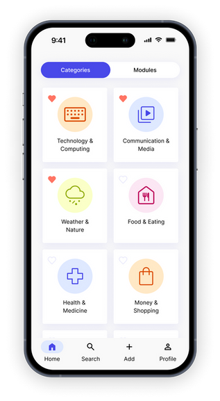
Building on the information architecture and wireframes, I created high-fidelity mockups to showcase core features and user flows. I explored concepts with AI tools (Stitch, V0, Lovable) and refined them in Figma to present key functionality: searching for signs, voting on preferred signs, and uploading new videos with minimal steps. These visuals were presented by Accessifiers to Deaf organizations, securing cooperation from all six targeted groups to contribute sign videos.

RESULTS
-
Secured participation from 6 Deaf organizations, ensuring cultural accuracy and broad community buy-in for the dictionary.
-
Established a scalable design system (IA, style guide, and component library), laying the groundwork for consistency and faster iteration as the platform grows.
-
Defined MVP-ready user flows that prioritize accessibility while respecting performance constraints, making the product feasible to launch and expand.
NEXT STEPS
-
Conduct usability testing with Deaf community members to validate accessibility and identify areas for improvement.
-
Evaluate search and upload flows through iterative testing to refine ease of use and efficiency.
-
MVP launch for interpreters to begin contributing sign videos and populate the dictionary.


