CareNest: Health Records, Simplified
A mobile app that makes it easy for parents to organize, track, and share their kids’ health information.

Tl;dr
I designed CareNest, a conceptual mobile app that helps parents and caregivers manage their children’s healthcare in one place. After interviewing caregivers and uncovering pain points with scattered portals and missed deadlines, I created archetypes, user flows, and information architecture to guide design decisions. Through wireframing, prototyping, and usability testing, I iterated on features like child profiles, appointment scheduling, and record sharing. The result was a polished concept that streamlines healthcare management while showcasing my skills in research, UX/UI design, and iterative prototyping.
Affiliation
Conceptual
skills
User research, journey mapping, information architecture, wireframing, prototyping, usability testing, iteration
team
Sole UX/UI Designer
tools
Figma, Miro, Canva
design challenge
The Chaos of Kids' Healthcare
Parents struggle with scattered healthcare portals, missed deadlines, and tedious paperwork. Managing multiple kids’ records across providers often leads to frustration, wasted time, and disorganization.
solution
Streamlined Management
CareNest streamlines children’s healthcare by consolidating records, appointments, and reminders into one app. With personalized profiles, easy sharing, and quick exporting for schools or camps, caregivers can manage health needs effortlessly and stay organized.


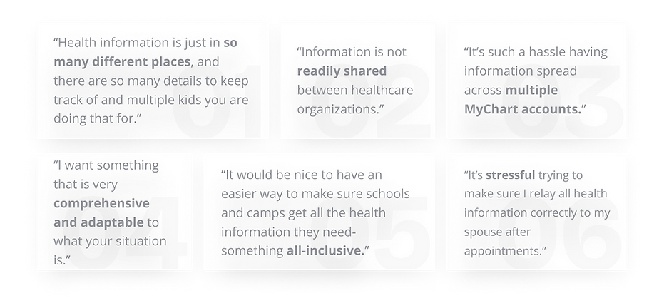
user research
Real Families, Real Challenges
I conducted interviews with parents and caregivers to understand how they currently manage their children’s healthcare. I asked about their methods, challenges, and desired features in a management app. Insights revealed frustration with scattered portals, difficulty sharing information, and the burden of organizing records for schools and camps, pointing to clear opportunities for improvement.
.png)
COMPETITOR RESEARCH
The Gaps in Existing Solutions
All of my interview participants currently use MyChart to manage and review their children’s healthcare. However, both parents and online MyChart reviewers expressed similar frustrations:
-
Needing separate accounts for each child
-
Lack of calendar and reminder features
-
Difficulty scheduling across providers
-
Inability to view or consolidate all appointments in one place.
These consistent gaps highlighted clear opportunities for CareNest to deliver a more unified and user-friendly experience.

RESEARCH SYNTHESIS
Consolidating Insights Into Themes
Based on the insights gathered from user and competitor research, 4 main pain points emerged:
1. SCATTERED
Difficult to access and manage health information when it is spread out among separate MyChart systems.
2. DISCONNECTED
Challenging to share health information with spouses and other caregivers.
3. OVERWHELMING
Complicated to schedule, track, and manage healthcare appointments and deadlines for multiple children.
4. TEDIOUS
Time-consuming to search for and organize health information to send to schools/camps.
USER GROUPS
Caregiver Archetypes
From my research, I created two personas to capture core user needs. These personas shaped my design decisions and kept solutions anchored in real user challenges.
-
The Juggling Parent represents busy parents managing healthcare for multiple children and needing simple ways to share records with other caregivers.
-
The Complex Caregiver represents parents supporting children with ongoing medical conditions who require a more detailed, organized system.

The Juggling Parent
Managing healthcare for multiple children
MOTIVATIONS
-
Centralized system for all children’s records
-
Simple sharing with spouse/caregivers
-
Stay on top of school and camp requirements
PAIN POINTS
-
Disorganized health records across multiple portals
-
Hard to track deadlines for multiple children
-
Difficulty sharing information with spouses or other caregivers

The Complex Caregiver
Managing healthcare for children with medical conditions
MOTIVATIONS
-
Consolidated access to all specialists and records
-
Track medications, refills, and side effects
-
Confidently share care instructions with schools/camps
PAIN POINTS
-
Multiple portals for specialists and medications
-
Overwhelmed managing prescriptions and details
-
Stress about missing critical information for camps
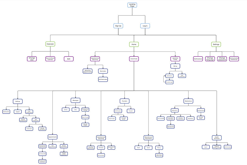
information architecture & wireframing
Structuring the Experience
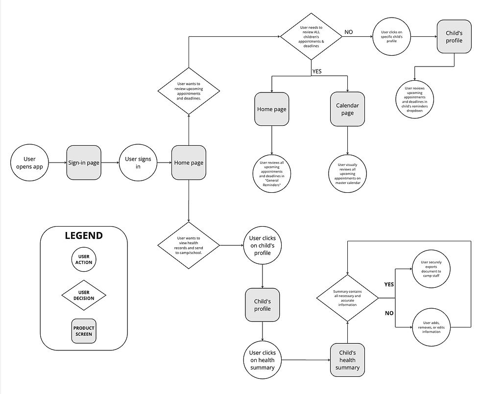
I mapped user flows for two key tasks:
-
Reviewing upcoming appointments and deadlines.
-
Viewing health records to send to schools or camps.
Building on research insights and journey maps, I then created an information architecture that defined the core pages and sections of CareNest, ensuring the app was structured around real caregiver needs.
WIREFRAMING
Initial Designs
With a clear understanding of user needs, I sketched multiple variations of key screens and marked the strongest ideas to merge into the digital wireframes.


usability testing
Refining the Design
I conducted four usability tests with a low-fidelity prototype, asking participants to complete seven core tasks. Examples included viewing the calendar by week, scheduling a new appointment, and navigating to a child’s profile settings.
Testing surfaced two key pain points:
-
Profile Settings: Users confused child-specific settings with general account settings. To resolve this, I relocated profile settings into the child’s profile and added clear labels, aligning placement with user expectations.
-
Profile Codes: Users were unsure when to create versus enter a code. I clarified this by adding contextual explanations on the onboarding screen and reinforcing instructions in the profile creation flow.


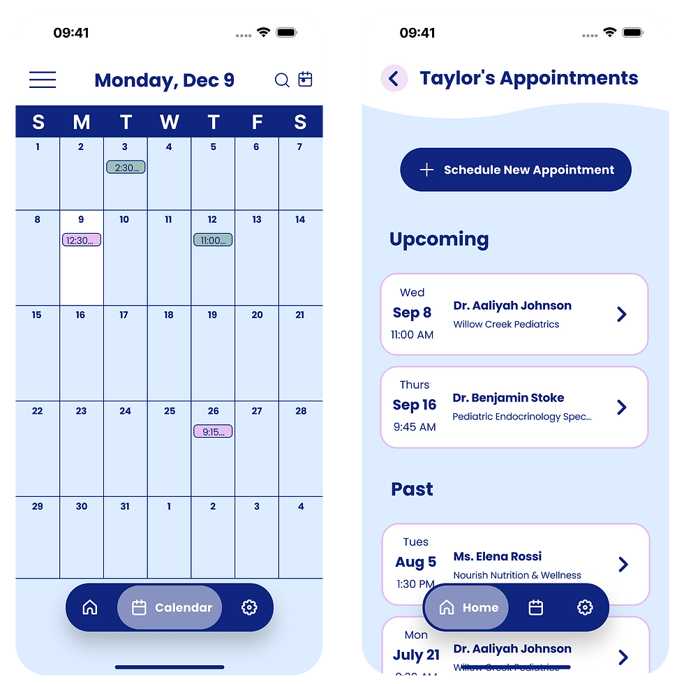
high fidelity mockups
Final Design


KEY FEATURE 1
One App, Every Child
Centralize all of your children’s healthcare in one place with individual profiles. Access records from every provider, manage multiple kids seamlessly, and share information with caregivers while controlling permissions.

KEY FEATURE 2
Never Miss a Checkup
Stay on top of appointments and deadlines with effortless scheduling, color-coded calendars, and customizable reminders. Sync with your phone’s calendar and book across providers without juggling multiple systems.
KEY FEATURE 3
Paperwork, Handled
Quickly organize and export essential health records, so forms for schools, camps, and activities are ready when you need them.

KEY FEATURE 4
Medications Made Simple
Track prescriptions, refills, and side effects in one place, with built-in GoodRx integration for cost-saving options.


LEARNINGS
-
Combined my biology background with design to address real healthcare challenges
-
Strengthened wireframing, prototyping, and usability testing skills
-
Saw the value of user feedback and iteration in creating impactful designs
NEXT STEPS
-
Adapt features for elderly care and multi-generational caregiving
-
Broaden use cases beyond pediatrics to support diverse caregivers
-
Conduct additional usability testing with a larger caregiver group
Explore More Case Studies

Leading UX Design for a Sign Language Video Dictionary

