Libelle: Reimagining Skilled Volunteer Organization for Nonprofits
PROJECT IN-PROGRESS


Tl;dr
I'm currently designing a web-based volunteer intake & onboarding platform with The Chamber of Us (TCUS) to help nonprofits better organize and match skilled volunteers. I’ve designed responsive landing and about pages to introduce the platform and build trust, created mockups and iterations of the intake form and future admin dashboard. This foundation sets the stage for scalable SaaS dashboards, volunteer profiles, and AI-powered project matching.
Affiliation
The Chamber of Us (TCUS)
skills
Responsive Web Design, User Flows, High-Fidelity Mockups
team
2 UX Designers, 2 Developers, Product Manager, Project Manager
tools
Figma, Figma Make, Miro, Slack
design challenge
The Chamber of Us (TCUS) faced a common nonprofit challenge: a growing base of skilled, willing volunteers, but no reliable system to collect, organize, or match their information. Volunteer forms were often vague, expectations unclear, and follow-up inconsistent. On the organizational side, coordinators dealt with scattered, messy data, making it hard to match volunteers efficiently. The goal was to simplify intake, reduce cognitive load, and build trust through clear consent and privacy. Ultimately, TCUS needed to bridge the gap between “wanting to help” and “getting involved,” while laying a scalable foundation for future volunteer management.
Solution
Libelle is a web-based platform that turns volunteer intake into a clear, guided experience. The MVP includes a responsive landing page that introduces the platform and invites users to get involved.
It also features a consent-forward intake form that captures skills, availability, and interests. Volunteer data is structured into a spreadsheet, enabling early-stage manual matching. Future iterations will evolve into a full admin dashboard with AI-powered matching to scale with the organization’s needs.
category text
Heading Text
Add paragraph text. Click “Edit Text” to update the font, size and more. To change and reuse text themes, go to Site Styles.


user groups & USER FLOW
Understanding the Users

Skilled Volunteers
-
Wants a smooth, quick onboarding flow.
-
Wants to share skills, availability, and motivations without complex forms.
-
Needs assurance that their data is secure and being used ethically.
-
Values clear next steps and acknowledgment after submission.

TCUS Admin
-
Needs structured volunteer data that’s easy to filter and interpret.
-
Wants to see volunteer skills, experience level, and motivations in one place.
-
Requires a trustworthy process that feels professional and secure.
Our initial focus was mapping the volunteer-facing flow. I created a user flow to diagram the screens, actions, and decisions that would be made when volunteers interact with Libelle.
-
A volunteer discovers Libelle through LinkedIn, VolunteerMatch, or TCUS campaigns.
-
They land on the Libelle Landing Page, learn about the mission, and click “Get Involved.”
-
The CTA leads to a structured intake form where they provide their name, email, areas of interest, and upload their resume.
-
They review the privacy and consent statement, submit, and receive confirmation.


iterations
Refining the Design
During weekly design meetings, I collaborated with the team to refine features in ways that balanced fairness, usability, and accessibility:
-
Voting removed from thumbnails to prevent snap judgments, ensuring users evaluate signs based on content rather than popularity.
-
Equal-sized thumbnails introduced to reduce bias toward older uploads, specific organizations, or certain interpreters.
-
Vertical scrolling for video playback adopted to align with familiar mobile patterns and improve ease of use.
-
Contributor and organization details moved above the video, with vote count and share button placed at the bottom for clear visibility and quick access.


High-Fidelity & Responsive Design
Creating the Platform
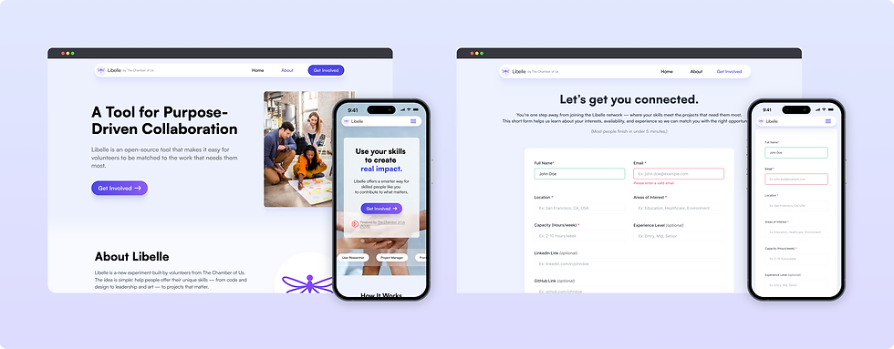
To build credibility and accessibility from the start, I designed responsive versions of the Landing and About pages to establish trust and clarity across devices. The Landing page introduces Libelle’s mission with a clear CTA and transparent process overview, while the About page deepens the story by highlighting the platform’s vision, community impact, and the symbolism behind its name. Both pages use clean hierarchy, emotionally resonant imagery, and accessible copy to reduce cognitive load and build trust. Collaborating with the other designer, we also finalized the form fields and created the final intake form design.


high fidelity mockups
Bringing the App to Life
Building on the information architecture and wireframes, I created high-fidelity mockups to showcase core features and user flows. I explored concepts with AI tools (Stitch, V0, Lovable) and refined them in Figma to present key functionality: searching for signs, voting on preferred signs, and uploading new videos with minimal steps. These visuals were presented by Accessifiers to Deaf organizations, securing cooperation from all six targeted groups to contribute sign videos.


High-Fidelity & Responsive Design
Next Steps: Admin Dashboard
The next phase focuses on designing the admin dashboard for Libelle, giving coordinators an intuitive way to manage volunteer data and project matching. Planned features include an overview panel for quick insights into volunteer and project activity, a volunteer directory with advanced filtering and search, and data analysis tools to visualize trends in skills, availability, and engagement. The goal is to create a clear, actionable interface that streamlines coordination today and scales seamlessly as Libelle evolves.


RESULTS SO FAR
-
Secured participation from 6 Deaf organizations, ensuring cultural accuracy and broad community buy-in for the dictionary.
-
Established a scalable design system (IA, style guide, and component library), laying the groundwork for consistency and faster iteration as the platform grows.
-
Defined MVP-ready user flows that prioritize accessibility while respecting performance constraints, making the product feasible to launch and expand.
NEXT STEPS
-
Conduct usability testing with Deaf community members to validate accessibility and identify areas for improvement.
-
Evaluate search and upload flows through iterative testing to refine ease of use and efficiency.
-
Prepare an MVP launch for interpreters to begin contributing sign videos and populate the dictionary.